CROISSANT CRUNCH
Crafting a Delicious Digital Experience Croissant Crunch Website
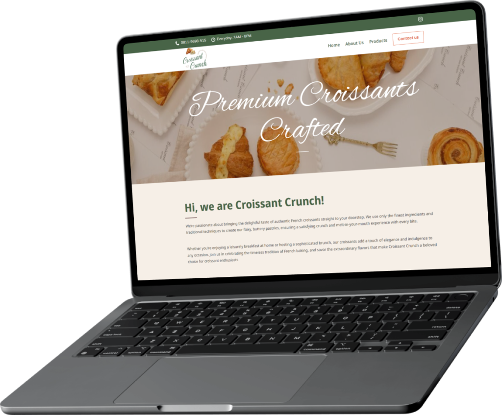
Our team crafted website copy and designed a user-friendly and visually appealing website layout that showcases Croissant Crunch’s brand identity and makes navigating the product selection a breeze.
The Brief
- Create a visually appealing and informative website for Croissant Crunch, a bakery specializing in authentic French croissants.
- Highlight the use of authentic French techniques and ingredients.
- Mention the location of the bakery in Patal Senanyan.
- Showcase a variety of croissant options on website
What We Do
We will also ensure that the website clearly communicates the location of Croissant Crunch in Patal Senanyan, making it easy for customers to find the bakery. Showcasing a diverse selection of croissant options on the website menu helps Croissant Crunch appeal to a wider audience, encourage repeat business, demonstrate expertise, and create a unique selling point.
The Result
Our redesigned website for Croissant Crunch not only preserves the brand’s authentic French heritage but also enhances the user experience. We’ve optimized the navigation, improved mobile responsiveness, and incorporated high-quality visuals to create a visually appealing and intuitive platform. The new site also features a streamlined online ordering process and is optimized for search engines to drive more traffic. We believe these enhancements will help Croissant Crunch attract new customers and strengthen its online presence.
NEXT WORK
FINARDI&CO
